This project is currently being added to, as I’ve taken on my own 100 Days of Design challenge. Initially, this challenge consisted of primarily critiques of other designer’s work, but lately has changed to me doing my own designs based on daily challenges I generated from ChatGPT.
View Live Website: edzoocation.com
edZOOcation™ was in need of a new website for their direct-to-consumer e-commerce strategy.
Initial improvements of performance on the new site came from using Shopify’s CDN as well as “lazy-loading” to decrease page load time, which ultimately boosted their SEO as a result.
I conducted extensive research into their main competitor through a screen flow analysis. I made comments on every single touch point for the user. I also made recommendations for improving their sales funnel and worked with a full stack engineer to call out the product IDs in the code, allowing for updated product metadata to automatically flow into the UI.
I also built their UI design system in Adobe XD from scratch, and continuously improved upon it as new components and styles were introduced, allowing for a much more streamlined process for future prototyping.
The major improvements to speed and IA led to an astonishing increase in the overall conversion rate of the website, which the baseline started at an industry average of 2% conversion rate prior to the IA overhaul and then rose up to a high 3.5% average conversion rate post IA overhaul.
I worked as a UX Designer to help research and draft initial mockups for the new Tacori.com website.
Through conducting a competitive analysis, we discovered that competitors missed on showcasing jewelry at the largest scale possible, especially on mobile. This was a perfect opportunity for Tacori to zoom in on their value proposition, the finest detail and hand craftsmanship unrivaled when given a deeper look.
The ring details page was focused on showing the product at the largest scale possible by default, with simplifying the rest of the UI so there were minimal distractions from the intimate details of such an exquisite ring setting.
Usability testing of the new design validated that users enjoyed the elegant simplicity of the UI.
At United Capital, I was tasked with refreshing some of their internal tools for their investment advisors.
Working with the VP of Product Management, we interviewed advisors to understand their needs in their workflow, such as improving portfolio management proposals, so they could better serve their clients.
After the interviews, I created a design backlog focused on the discovered problems and simply worked with the team to solve each problem one by one.
We were able to research, design, prototype, test and validate usability issues within a single month.
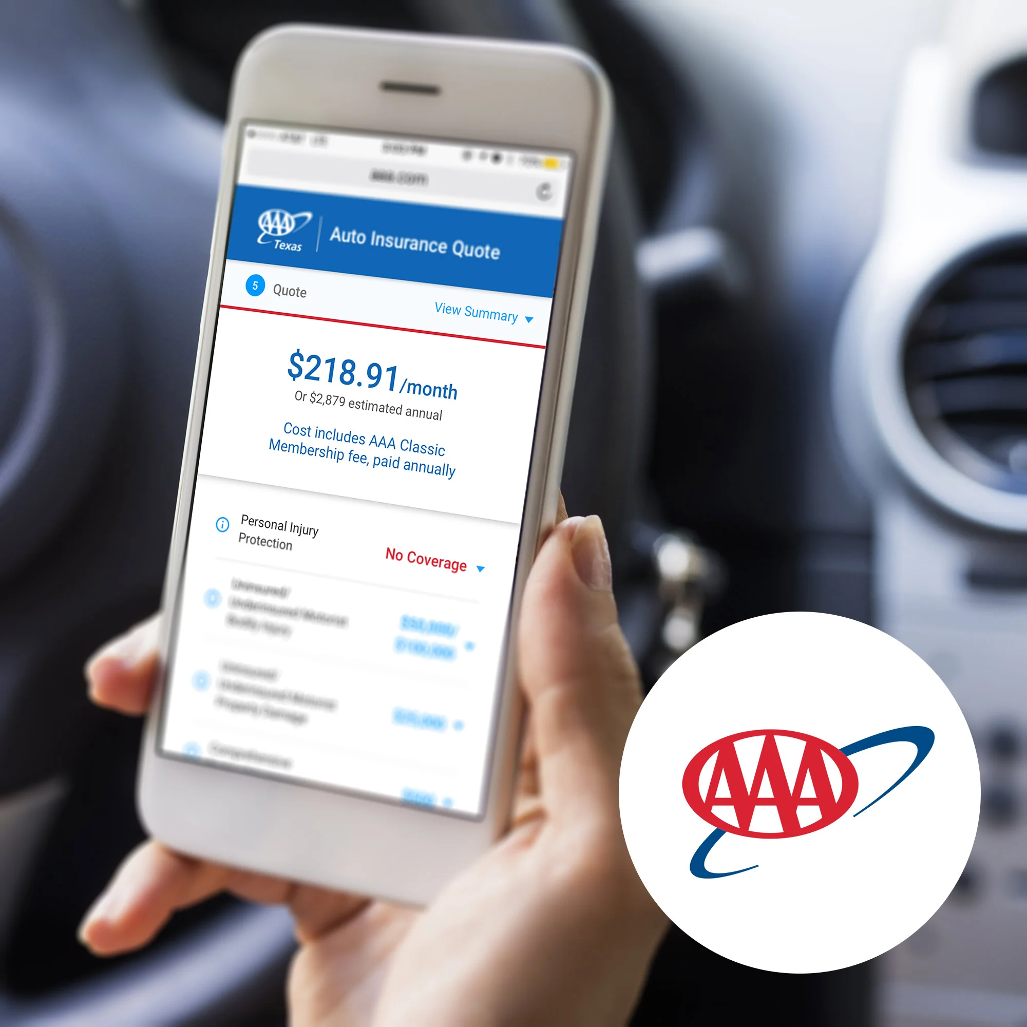
I assisted AAA with designing UI and conducting usability testing for their auto insurance quote and online binding experience.
Using their style guide and Bootstrap 3 framework guidelines, I designed the mobile experience from lead contact generation all the way through the Thank You page.
I sketched wireframes with their team, drafted the user flow chart as a project management guide for UI, then designed the interface in Sketch.
From Sketch, I created the prototype using InVision as it integrates with Sketch and UserTesting.com very well and streamlines the user testing process.
I used Lean UX principles in designing the experience; testing, learning, iterating and repeating the process until most usability issues were resolved in design. This project is currently in production.
CBS Interactive is the digital branch of CBS corporation.
At CBSi, I worked on managing the user experience for the CBS app on all emerging platforms including OTT: Apple TV, Roku, Amazon Fire TV, Android TV and XBox 360, as well as their mobile platforms: iOS, Android and Windows 10 mobile.
The biggest project I worked on was the release of their Commercial Free experience. I worked directly with the Product Team to understand upsell entry points, solve use cases, prototype and conduct UX QA for an effective deployment.
One of the largest moving companies in the US was looking create a new booking experience for their customers.
Naturally, the Virgin America booking UX comes to mind when thinking about a unique booking system to model from.
For this UX pitch at a large marketing agency, I conducted the initial discovery for the pitch deck including: industry landscape, competitive analysis, booking analysis, mobile opportunity, sketching, user personas, user scenarios and wireframe concepts for responsive web and native mobile apps.
I led the UX design on a project for TAG Heuer, premium watch brand.
TAG was looking for a way to allow customers to browse their line of watches as an embedded catalog in reseller websites. This would allow tremendous brand control for TAG as they could create a consistent catalog experience throughout all of the web.
It was important to also engage the user with the TAG Heuer brand and their #DontCrackUnderPressure campaign.
I drafted the exit criteria using user stories as features. I worked with the developer and project manager to draft the SOW.
I handed off the wireframes to the UI designer, working with him to envision the brand and story elements.
We ultimately created a responsive iframe widget that resellers could embed easily into their websites that introduced users to unique brand-centric stories that ended with a catalog experience. CMS users from TAG Heuer could create branded stories and curate the product catalog.
It has been a successful content-first, mobile-first responsive approach to creating a streamlined brand and product experience.